One of my favorite things about Apple’s current generation of operating systems is that widgets have been given an overhaul. While it’s a fair criticism to say that widgets lost a bit of functionality from years past, I think it’s a fair tradeoff given the design benefits. Up until this point, every app developer more or less made the widgets that they wanted to, without any regard for how that widget would look alongside the rest of the user’s widgets. That was more or less ok because widgets lived on the Today view…and only on the Today view.
I’d always get my Today view set up with all the widgets I wanted from the apps I most wanted to interact with in that way…and then would promptly forget about it. I just didn’t use the Today view like that. So when Apple announced that widgets were being redesigned this update cycle (and brought to the Home Screen on iPhones), I was ecstatic. You would think that the three years I spent on Android would have gotten widget fever out of my system, but I always found that widgets on Android suffered from the same issue as the previous iOS ones: they didn’t have the same aesthetic. That always bothered me.
But even though widgets look the same across all of Apple’s platforms (and follow the same interactivity rules), there’s a few areas where widgets differ from platform to platform and I’d like to talk about that today. Attached in each section are screenshots of my home screens, along with some of the widgets I have. I’m actually in the process of coming up with some new ideas for layouts for my iPhone Home Screen so this may change over time, but this is how its setup now.
iPhone Widgets
For what it’s worth, I think that out of all of Apple’s widget implementations currently available, the implementation on the iPhone is the best. There are some changes that I’d like to see (which I’ll be writing about closer to WWDC ’21) but for my use case, what we have really works for me.
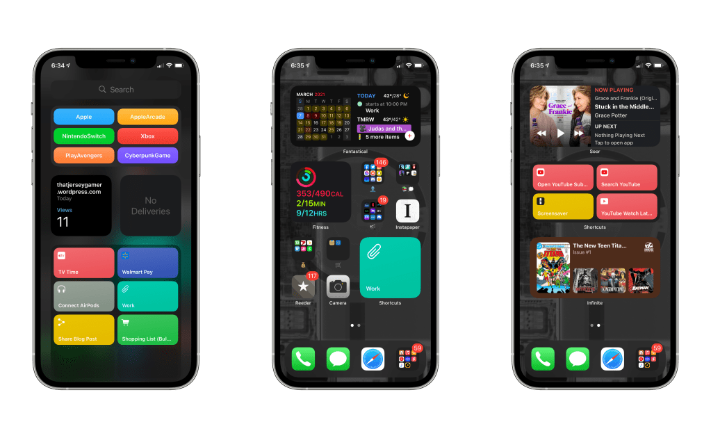
Now I do try and keep as many of my widgets in stacks as I can, mainly so I know where to go to find certain pieces of information. For example, all of my music widgets live in a single stack on my second Home Screen (the third one in the image). And I would really like to touch on that. Up until iOS 14, I never cared for the today view…but now with the way iOS is structured, I am actually stating to use it. I think I have the App Library to thank for that. When designing the layout for my Home Screen, I wanted to have all of the apps I need accessible, as well as as many widgets as I want…but not at the cost of too many swipes to get to the App Library. I could write a whole article about Spotlight and the App Library and how I launch apps, but that’s a bit too in the weeds right now for me. So let’s just say that’s what has given the Today view another shot at life. It also helps that I’m starting to change the way I think about things…mainly that my first home screen lives in the middle and I can just swipe left or right depending on what I need.
For the most part, all of these widgets are straightforward, but the one that’s showing on the music stack is one that I really want to highlight. It’s for an app called Soor. Soor is a third-party Apple Music client that I found out about through the Federico Viticci over at MacStories. The developer did something really ingenious. You see, Apple does not have a framework in place for widgets that can control playback of music, so the developer came up with an interesting work around. Pressing one of those playback control buttons opens the app for the briefest second, and then crashes it right back to the Home Screen. On a technical level, I’d say that’s operating within the confines of Apple’s widget design guidelines.
Past that, there’s not a lot that I feel I have to say about widgets on the iPhone at this time. My wishlist is coming, but there’s never really a point where widgets on the iPhone frustrate me to any significant degree. I feel like anyone who gives them a chance will quickly realize that. Unfortunately, things aren’t so great on Apple’s other two platforms.
iPad Widgets
I feel like I’m getting ready to hop back up on a soapbox I’ve absolutely been on before. Last time, however, I only touched on the subject a bit. This time is more of a deep dive. For anyone who isn’t familiar with how widgets work on the iPad, let me give you a quick overview: they live on the left side of the screen and need to be swiped in, but can also be pined to the Home Screen in landscape mode, but still in a single column on the left.
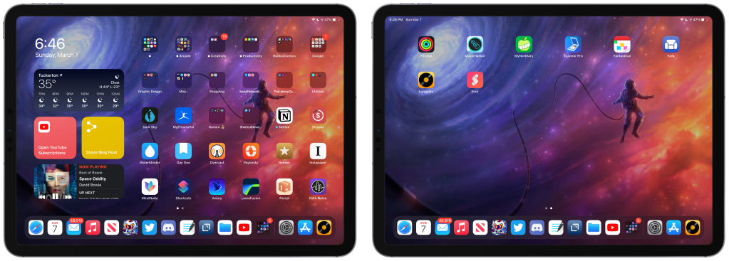
My first big issue with widgets on the iPad is that they live in a single column. “Out of sight, out of mind” is the same issue I had with the Today view for years, until Apple finally let us take those widgets and let us put them anywhere we want. Letting us pin them to the screen in landscape mode is a step in the right direction for sure, but I really feel like Apple could do more. Back when I wrote that article I said the following:
From what I can tell, the widgets are scaled to more or less the same size and there’s plenty of space on the iPad Home Screen to accommodate a mix of widgets and apps.
I still believe that, I really do. And I think on a device like the iPad, being able to intermingle the two components of the Home Screen would be a huge benefit for users. But the implementation on the iPad is nothing compared to the number Apple did to widgets on macOS.
macOS Widgets
I like to think that I’m a pretty straight shooter: if something’s good, I’ll tell you it’s good, though if it sucks, I’m gonna tell you that it does. And let me tell you…widgets on macOS suck!
Visually, they’re fine. Interacting with them…is also fine. Small widget has one click point, larger ones have multiple…they basically behave the same as their iDevice counterparts. In fact, much like the iPad, where widgets live exclusively to the left, macOS has widgets that get swiped in from the right (or you can click on the time). But past that is where the macOS iteration of widgets begins to feel incomplete.
The reason I say that is because on macOS…you cannot STACK WIDGETS! I don’t get it. I really don’t understand it. At first I was thinking,”Well on the Mac you use a mouse and trackpad to navigate so swiping though stacks isn’t intuitive”. Then I looked at my bluetooth mouse I use with my iPad and remembered that the magic keyboard is a thing and that argument went right out the window.
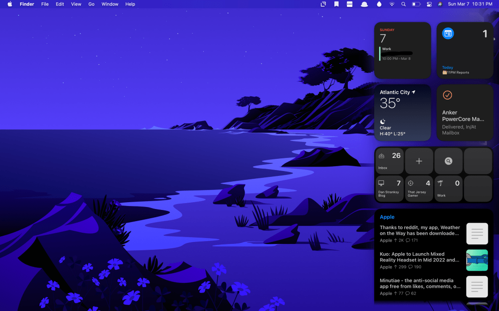
So I have nothing. I have no understanding or idea why widgets are missing a feature that’s on every other platform. But it really drives home the thought in my mind that I want widgets to be consistent across all platforms. When I say that, I don’t mean take away features from the way this system works on the iPhone…I mean expand it out to everything. I don’t care what device I’m using…let me stack my widgets and let me place them anywhere, Apple.
What widgets are you using on your Apple devices? Let me know down in the comments below!
